Chapter 6 - Exploring detections data
Source:vignettes/articles/06-exploring-data.Rmd
06-exploring-data.RmdIn this chapter, we’ll finally start exploring our data by summarizing, plotting and mapping.
Once you have clarified any possible ambiguous tags and removed false positives, you are ready to start analyzing your clean data set. This chapter will walk you through some simple procedures to start working with and visualizing the clean sample data set; you can modify these scripts to work with your own data. For a more in-depth R tutorial we strongly recommend working through R for Data Science by Garrett Grolemund and Hadley Wickham.
Load required packages
Follow the instructions in Chapter 2 to install the following packages before loading, if you haven’t already done so.
Load data
If you followed along with the the previous Chapter (Chapter 5 - Data cleaning) and are
working with the cleaned df_alltags_sub file, you can skip
this step and go directly to Summarizing your data.
Otherwise, if you saved your data as an RDS file, you can load it using:
df_alltags_sub <- readRDS("./data/dfAlltagsSub.rds") # change dir to local directoryOr, if you’ve applied a custom filter to your .motus
file, you can load the previously downloaded sample Motus data (see Chapter 3) and clean it now. Currently
the main benefit of using the custom filter is that you apply the filter
to the .motus file, which allows you more flexibility in
applying dplyr functions to manage and filter the data
(e.g., you can select different variables to include in the data than we
included in the RDS file in Chapter 5 -
Data cleaning). This approach also allows you to more readily
integrate new data added to your database with the tagme()
function. Because we are selecting the same variables and filtering the
same records, the following gives you the same dataset as the
readRDS() statement above:
# load the .motus file (remember 'motus.sample' is both username and password)
sql_motus <- tagme(176, dir = "./data/")
## Checking for new data in project 176## Updating metadata## activity: 1 new batch records to check## batchID 1977125 (# 1 of 1): got 156 activity records## Downloaded 156 activity records## nodeData: 0 new batch records to check## Fetching deprecated batches## Total deprecated batches: 6
## New deprecated batches: 0
tbl_alltags <- tbl(sql_motus, "alltags")

# obtain a table object of the filter
tbl_filter <- getRunsFilters(sql_motus, "filtAmbigFalsePos")

# filter and convert the table into a dataframe, with a few modications
df_alltags_sub <- left_join(tbl_alltags, tbl_filter, by = c("runID", "motusTagID")) %>%
  mutate(probability = ifelse(is.na(probability), 1, probability)) %>%
  filter(probability > 0) %>%
  collect()

# Now Let's clarify the dates and names for use in the following examples
df_alltags_sub <- df_alltags_sub %>%
  mutate(time = as_datetime(ts),  # work with times AFTER transforming to flat file
         tagDeployStart = as_datetime(tagDeployStart),
         tagDeployEnd = as_datetime(tagDeployEnd),
         recvDeployName = if_else(is.na(recvDeployName),
                                  paste(recvDeployLat, recvDeployLon, sep=":"),
                                  recvDeployName))
Note that if your project is very large, you may want to convert only a portion of it to the dataframe, to avoid memory issues.
Details on filtering the tbl prior to collecting as a
dataframe are available in Converting to flat
data in Chapter 3.
Here we do so by adding a filter to the above command, in this case,
only creating a dataframe for motusTagID 16047, but you can
decide how to best subset your data based on your need (e.g. by species
or year):
# create a subset for a single tag, to keep the dataframe small
df_alltags_16047 <- filter(df_alltags_sub, motusTagID == 16047)
Summarizing your data
Here we will run through some basic commands, starting with the
summary() function to view a selection of variables in a
data frame:
sql_motus %>%
  tbl("alltags") %>%
  select(ts, motusTagID, runLen, speciesEN, tagDepLat, tagDepLon,
         recvDeployLat, recvDeployLon) %>%
  collect() %>%
  mutate(time = as_datetime(ts)) %>%
  summary()
## ts motusTagID runLen speciesEN
## Min. :1.438e+09 Min. :10811 Min. : 2.0 Length:109474
## 1st Qu.:1.476e+09 1st Qu.:22897 1st Qu.: 30.0 Class :character
## Median :1.477e+09 Median :22905 Median : 120.0 Mode :character
## Mean :1.476e+09 Mean :22639 Mean : 353.8
## 3rd Qu.:1.477e+09 3rd Qu.:23316 3rd Qu.: 402.0
## Max. :1.498e+09 Max. :24303 Max. :2474.0
##
## tagDepLat tagDepLon recvDeployLat recvDeployLon
## Min. :11.12 Min. :-80.69 Min. :-42.50 Min. :-143.68
## 1st Qu.:50.19 1st Qu.:-63.75 1st Qu.: 50.20 1st Qu.: -63.75
## Median :50.19 Median :-63.75 Median : 50.20 Median : -63.75
## Mean :50.15 Mean :-65.86 Mean : 48.50 Mean : -65.68
## 3rd Qu.:50.19 3rd Qu.:-63.75 3rd Qu.: 50.20 3rd Qu.: -63.75
## Max. :51.80 Max. :-63.75 Max. : 62.89 Max. : -60.02
## NA's :2069 NA's :2069 NA's :173 NA's :173
## time
## Min. :2015-07-23 10:10:54
## 1st Qu.:2016-10-10 21:26:15
## Median :2016-10-19 15:29:45
## Mean :2016-10-12 05:31:23
## 3rd Qu.:2016-10-22 06:44:40
## Max. :2017-06-26 16:11:04
##
# same summary for the filtered sql data
df_alltags_sub %>%
  select(time, motusTagID, runLen, speciesEN, tagDepLat, tagDepLon,
         recvDeployLat, recvDeployLon) %>%
  summary()
## time motusTagID runLen
## Min. :2015-08-03 06:37:11 Min. :16011 Min. : 4.0
## 1st Qu.:2016-10-06 19:17:36 1st Qu.:22897 1st Qu.: 27.0
## Median :2016-10-09 21:48:11 Median :22897 Median : 97.0
## Mean :2016-09-05 10:37:42 Mean :22267 Mean : 235.1
## 3rd Qu.:2016-10-19 10:37:42 3rd Qu.:22897 3rd Qu.: 287.0
## Max. :2017-04-20 22:33:19 Max. :23316 Max. :1371.0
##
## speciesEN tagDepLat tagDepLon recvDeployLat
## Length:48133 Min. :50.19 Min. :-80.69 Min. :37.10
## Class :character 1st Qu.:50.19 1st Qu.:-63.75 1st Qu.:50.20
## Mode :character Median :50.19 Median :-63.75 Median :50.20
## Mean :50.34 Mean :-65.56 Mean :50.05
## 3rd Qu.:50.19 3rd Qu.:-63.75 3rd Qu.:50.20
## Max. :51.80 Max. :-63.75 Max. :51.82
## NA's :164
## recvDeployLon
## Min. :-80.69
## 1st Qu.:-63.75
## Median :-63.75
## Mean :-65.26
## 3rd Qu.:-63.75
## Max. :-62.99
## NA's :164The dplyr package allows you to easily summarize data by
group, manipulate variables, or create new variables based on your
data.
We can manipulate existing variables or create new ones with
dplyr’s mutate() function, here we’ll convert
ts to a date/time format, then make a new variable for year
and day of year (doy).
We’ll also remove the set of points with missing receiver latitude and longitudes. These may be useful in some contexts (for example if the approximate location of the receiver is known) but can cause warnings or errors when plotting.
df_alltags_sub <- df_alltags_sub %>%
  mutate(year = year(time), # extract year from time
         doy = yday(time)) %>% # extract numeric day of year from time
  filter(!is.na(recvDeployLat))

head(df_alltags_sub)
## # A tibble: 6 × 67
## hitID runID batchID ts tsCorrected sig sigsd noise freq freqsd slop
## <int> <int> <int> <dbl> <dbl> <dbl> <dbl> <dbl> <dbl> <dbl> <dbl>
## 1 45107 8886 53 1.45e9 1445858390. 52 0 -96 4 0 1e-4
## 2 45108 8886 53 1.45e9 1445858429. 54 0 -96 4 0 1e-4
## 3 45109 8886 53 1.45e9 1445858477. 55 0 -96 4 0 1e-4
## 4 45110 8886 53 1.45e9 1445858516. 52 0 -96 4 0 1e-4
## 5 45111 8886 53 1.45e9 1445858564. 49 0 -96 4 0 1e-4
## 6 199885 23305 64 1.45e9 1445857924. 33 0 -96 4 0 1e-4
## # ℹ 56 more variables: burstSlop <dbl>, done <int>, motusTagID <int>,
## # ambigID <int>, port <chr>, nodeNum <chr>, runLen <int>, motusFilter <dbl>,
## # bootnum <int>, tagProjID <int>, mfgID <chr>, tagType <chr>, codeSet <chr>,
## # mfg <chr>, tagModel <chr>, tagLifespan <int>, nomFreq <dbl>, tagBI <dbl>,
## # pulseLen <dbl>, tagDeployID <int>, speciesID <int>, markerNumber <chr>,
## # markerType <chr>, tagDeployStart <dttm>, tagDeployEnd <dttm>,
## # tagDepLat <dbl>, tagDepLon <dbl>, tagDepAlt <dbl>, tagDepComments <chr>, …We can also summarize information by group, in this case
motusTagID, and apply various functions to these groups
such as getting the total number of detections (n) for each
tag, the number of receivers each tag was detected on, the first and
last detection date, and the total number of days there was at least one
detection:
tagSummary <- df_alltags_sub %>%
  group_by(motusTagID) %>%
  summarize(nDet = n(),
            nRecv = length(unique(recvDeployName)),
            timeMin = min(time),
            timeMax = max(time),
            totDay = length(unique(doy)))

head(tagSummary)
## # A tibble: 6 × 6
## motusTagID nDet nRecv timeMin timeMax totDay
## <int> <int> <int> <dttm> <dttm> <int>
## 1 16011 116 1 2015-08-03 06:37:11 2015-08-05 20:41:12 3
## 2 16035 415 5 2015-08-14 17:53:49 2015-09-02 14:06:09 6
## 3 16036 62 1 2015-08-17 21:56:44 2015-08-17 21:58:52 1
## 4 16037 1278 3 2015-08-23 15:13:57 2015-09-08 18:37:16 14
## 5 16038 70 1 2015-08-20 18:42:33 2015-08-22 22:19:37 3
## 6 16039 1044 10 2015-08-23 02:28:45 2015-09-19 06:08:31 8We can also group by multiple variables; applying the same function
as above but now grouping by motusTagID and
recvDeployName, we will get information for each tag
detected on each receiver. Since we are grouping by
recvDeployName, there will be by default only one
recvDeployName in each group, thus the variable
nRecv will be 1 for each row. This in not very informative,
however we include this to help illustrate how grouping works:
tagRecvSummary <- df_alltags_sub %>%
  group_by(motusTagID, recvDeployName) %>%
  summarize(nDet = n(),
            nRecv = length(unique(recvDeployName)),
            timeMin = min(time),
            timeMax = max(time),
            totDay = length(unique(doy)), .groups = "drop")

head(tagRecvSummary)
## # A tibble: 6 × 7
## motusTagID recvDeployName nDet nRecv timeMin timeMax
## <int> <chr> <int> <int> <dttm> <dttm>
## 1 16011 North Bluff 116 1 2015-08-03 06:37:11 2015-08-05 20:41:12
## 2 16035 Brier2 38 1 2015-09-02 14:03:19 2015-09-02 14:06:09
## 3 16035 D'Estimauville 32 1 2015-09-02 07:58:43 2015-09-02 08:04:24
## 4 16035 Netitishi 274 1 2015-08-14 17:53:49 2015-09-01 21:35:32
## 5 16035 Southwest Head 65 1 2015-09-02 13:06:13 2015-09-02 13:14:39
## 6 16035 Swallowtail 6 1 2015-09-02 13:21:27 2015-09-02 13:22:22
## # ℹ 1 more variable: totDay <int>Plotting your data
Plotting your data is a powerful way to visualize broad and
fine-scale detection patterns. This section will give you a brief
introduction to plotting using ggplot2. For more in depth
information on the uses of ggplot2, we recommend the Cookbook for R, and the
RStudio ggplot2
cheatsheet.
To make coarse-scale plots with large files, we suggest first
rounding the detection time to the nearest hour or day so that
processing time is faster. Here we round detection times to the nearest
hour, then make a basic plot of hourly detections by
motusTagID:
df_alltags_sub_2 <- df_alltags_sub %>%
  mutate(hour = hour(time)) %>%
  select(motusTagID, port, tagDeployStart, tagDepLat, tagDepLon,
         recvDeployLat, recvDeployLon, recvDeployName, antBearing, speciesEN, year, doy, hour) %>%
  distinct()

ggplot(data = df_alltags_sub_2, aes(x = hour, y = as.factor(motusTagID))) +
  theme_bw() +
  geom_point() +
  labs(x = "Hour", y = "MotusTagID")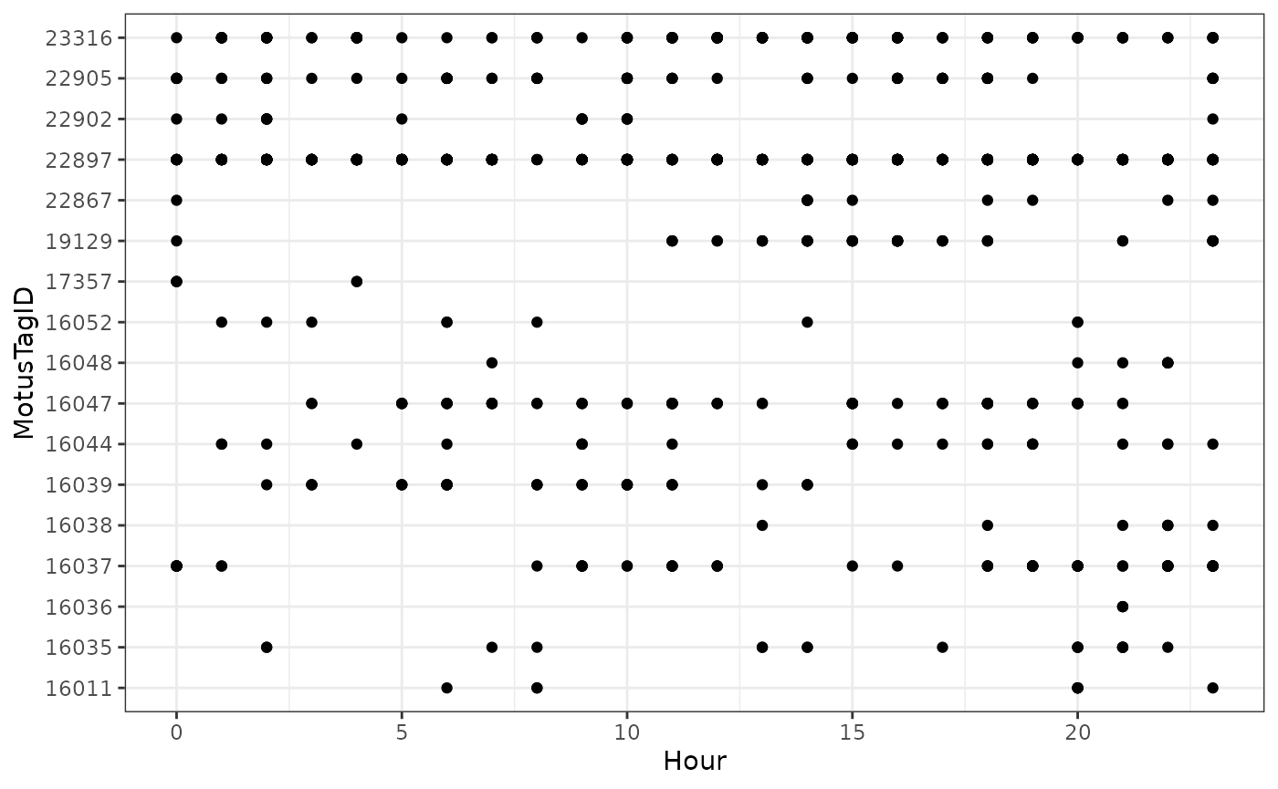
Let’s focus only on tags deployed in 2016, and we can colour the tags by species:
ggplot(data = filter(df_alltags_sub_2, year(tagDeployStart) == 2016),
       aes(x = hour, y = as.factor(motusTagID), colour = speciesEN)) +
  theme_bw() +
  geom_point() +
  labs(x = "Hour", y = "MotusTagID") +
  scale_colour_discrete(name = "Species")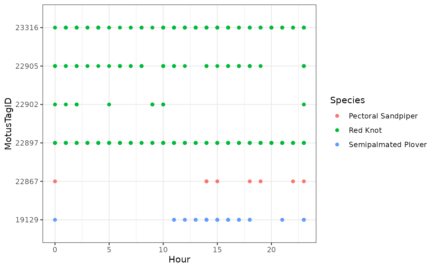
We can see how tags moved latitudinally by first ordering by hour,
and colouring by motusTagID:
df_alltags_sub_2 <- arrange(df_alltags_sub_2, hour)

ggplot(data = filter(df_alltags_sub_2, year(tagDeployStart) == 2016),
       aes(x = hour, y = recvDeployLat, col = as.factor(motusTagID),
           group = as.factor(motusTagID))) +
  theme_bw() +
  geom_point() +
  geom_path() +
  labs(x = "Hour", y = "Receiver latitude") +
  scale_colour_discrete(name = "MotusTagID")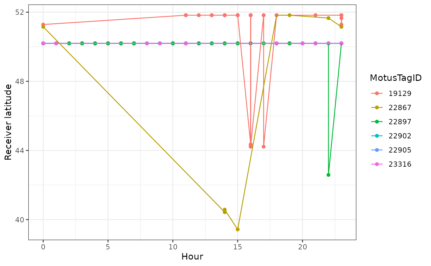
Now let’s look at more detailed plots of signal variation. We use the
full df_alltags_sub dataframe so that we can get signal
strength for each detection of a specific tag. Let’s examine fall 2016
detections of tag 22897 at Niapiskau; we facet the plot by deployment
name, ordered by decreasing latitude:
ggplot(data = filter(df_alltags_sub,
                     motusTagID == 22897,
                     recvDeployName == "Niapiskau"),
       aes(x = time, y = sig)) +
  theme_bw() +
  geom_point() +
  labs(x = "Time", y = "Signal strength") +
  facet_grid(recvDeployName ~ .)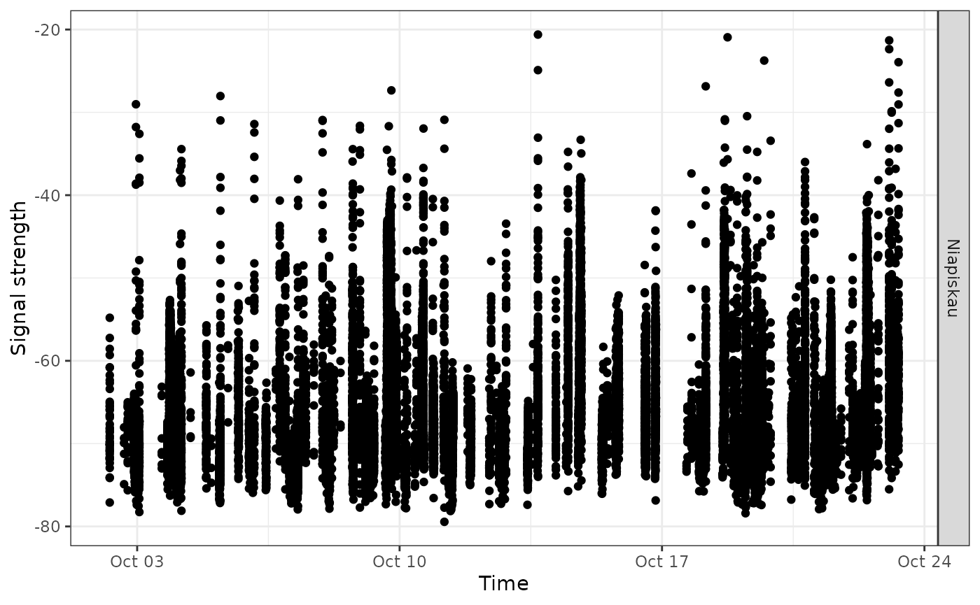
We use the sunRiseSet() to get sunrise and sunset times
for all detections. We then zoom in on a certain timeframe and add that
information to the above plot by adding a geom_vline()
statement to the code, which adds a yellow line for sunrise time, and a
blue line for sunset time:
# add sunrise and sunset times to the dataframe
df_alltags_sub <- sunRiseSet(df_alltags_sub, lat = "recvDeployLat", lon = "recvDeployLon")

ggplot(data = filter(df_alltags_sub, motusTagID == 22897,
                     time > "2016-10-11",
                     time < "2016-10-17",
                     recvDeployName == "Niapiskau"),
       aes(x = time, y = sig)) +
  theme_bw() +
  geom_point() +
  labs(x = "Time of year", y = "Signal strength") +
  geom_vline(aes(xintercept = sunrise), col = "orange") +
  geom_vline(aes(xintercept = sunset), col = "blue")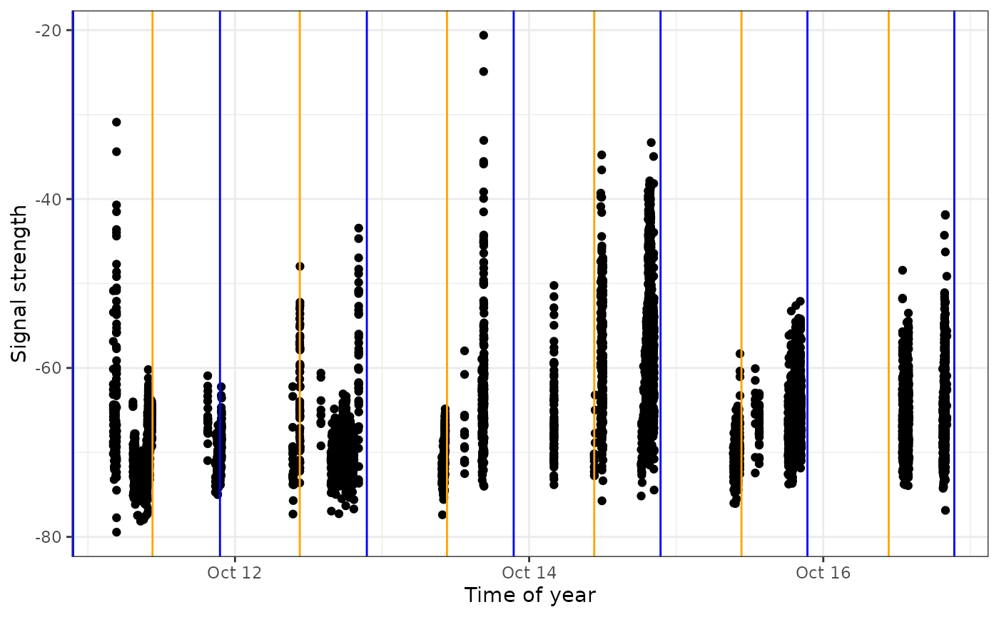
We can see that during this period, the tag was most often detected during the day, suggesting it may be actively foraging in this area during this time.
The same plots can provide valuable movement information when the
receivers are ordered geographically. We do this for
motusTagID 16039:
# We'll first order sitelat by latitude (for plots)
df_alltags_sub <- mutate(df_alltags_sub,
                         recvDeployName = reorder(recvDeployName, recvDeployLat))

ggplot(data = filter(df_alltags_sub,
                     motusTagID == 16039,
                     time < "2015-10-01"),
       aes(x = time, y = recvDeployName)) +
  theme_bw() +
  geom_point() +
  labs(x = "Time of year", y = "Receiver name (ordered by latitude)")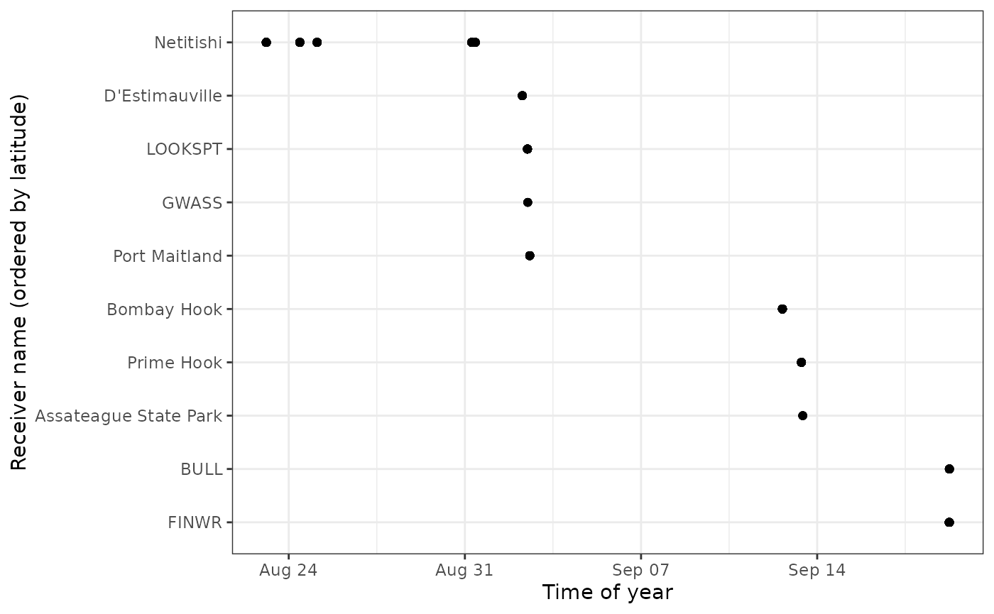
We zoom in on a section of this plot and look at antenna bearings to see directional movement past stations:
ggplot(data = filter(df_alltags_sub, motusTagID == 16039,
                     time > "2015-09-14",
                     time < "2015-10-01"),
       aes(x = time, y = sig, col = as.factor(antBearing))) +
  theme_bw() +
  geom_point() +
  labs(x = "Time of day", y = "Signal strength") +
  scale_color_discrete(name = "Antenna bearing") +
  facet_grid(recvDeployName ~ .)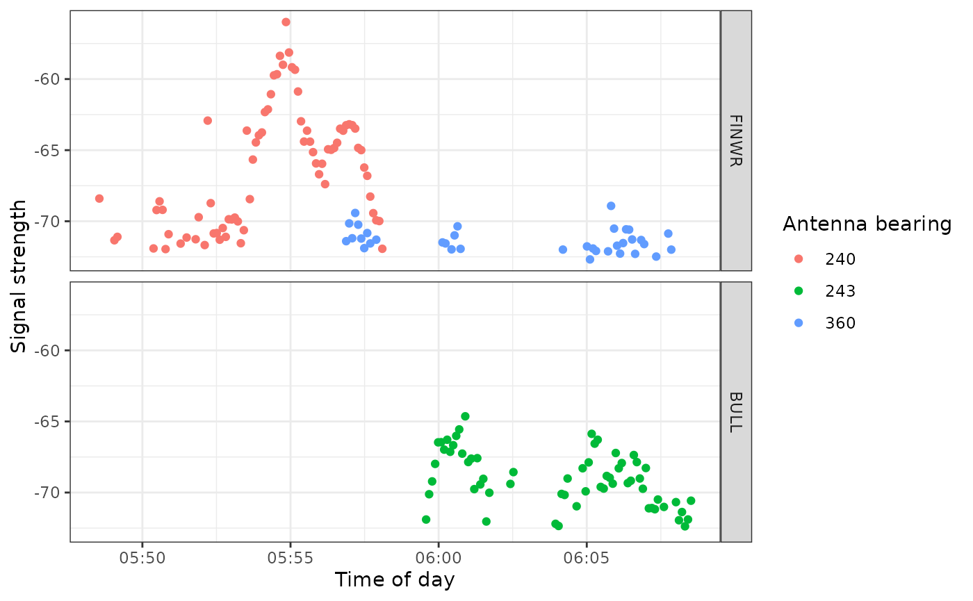
This plot shows the typical fly-by pattern of a migrating animal, with signal strength increasing and then decreasing as the tag moves through the beams of the antennas.
Mapping your data
To generate maps of tag paths, we will once again use summarized data so we can work with a much smaller database for faster processing. Here we’ll summarize detections by day. We will use code similar to the code we used in Chapter 5 - Data cleaning, however, here we will create a simple function to summarize the data, since we will likely want to do this type of summary over and over again.
# Simplify the data by summarizing by the runID
# If you want to summarize at a finer (or coarser) scale, you can also create
# other groups.

fun.getpath <- function(df) {
  df %>%
    filter(tagProjID == 176, # keep only tags registered to the sample project
           !is.na(recvDeployLat) | !(recvDeployLat == 0)) %>%
    group_by(motusTagID, runID, recvDeployName, ambigID,
             tagDepLon, tagDepLat, recvDeployLat, recvDeployLon) %>%
    summarize(max.runLen = max(runLen), time = mean(time), .groups = "drop") %>%
    arrange(motusTagID, time) %>%
    data.frame()
} # end of function call

df_alltags_path <- fun.getpath(df_alltags_sub)
df_alltags_sub_path <- df_alltags_sub %>%
  filter(tagProjID == 176) %>% # only tags registered to project
  arrange(motusTagID, time) %>%       # order by time stamp for each tag
  mutate(date = as_date(time)) %>%    # create date variable
  group_by(motusTagID, date, recvDeployName, ambigID,
           tagDepLon, tagDepLat, recvDeployLat, recvDeployLon)

df_alltags_path <- fun.getpath(df_alltags_sub_path)
Creating simple maps with the sf package
Mapping allows us to spatially view our data and connect sequential
detections that may represent flight paths in some cases. First we load
base maps from the rnaturalearth package. Please see Chapter 4 for
more detail if you have not already downloaded the
rnaturalearth shapefiles.
world <- ne_countries(scale = "medium", returnclass = "sf")
lakes <- ne_load(type = "lakes", scale = "medium", category = 'physical',
                 returnclass = "sf",
                 destdir = "map-data") # use this if already downloaded shapefiles
Then, to map the paths, we set the x-axis and y-axis limits based on
the location of receivers with detections. Depending on your data, these
might need to be modified to encompass the deployment location of the
tags, if tags were not deployed near towers with detections. We then use
ggplot and sf to plot the map and tag paths.
We add points for receivers and lines connecting consecutive detections
by motusTagID. We also include an ‘x’ for where tags were
deployed.
# just use the tags that we have examined carefully and filtered (in the
# previous chapter)
df_tmp <- df_alltags_path %>%
filter(motusTagID %in% c(16011, 16035, 16036, 16037, 16038, 16039)) %>%
arrange(time) %>% # arrange by hour
as.data.frame()
# set limits to map based on locations of detections, ensuring they include the
# deployment locations
xmin <- min(df_tmp$recvDeployLon, na.rm = TRUE) - 2
xmax <- max(df_tmp$recvDeployLon, na.rm = TRUE) + 2
ymin <- min(df_tmp$recvDeployLat, na.rm = TRUE) - 1
ymax <- max(df_tmp$recvDeployLat, na.rm = TRUE) + 1
# map
ggplot(data = world) +
geom_sf(colour = NA) +
geom_sf(data = lakes, colour = NA, fill = "white") +
coord_sf(xlim = c(xmin, xmax), ylim = c(ymin, ymax), expand = FALSE) +
theme_bw() +
labs(x = "", y = "") +
geom_path(data = df_tmp,
aes(x = recvDeployLon, y = recvDeployLat,
group = as.factor(motusTagID), colour = as.factor(motusTagID))) +
geom_point(data = df_tmp, aes(x = recvDeployLon, y = recvDeployLat),
shape = 16, colour = "black") +
geom_point(data = df_tmp,
aes(x = tagDepLon, y = tagDepLat), colour = "red", shape = 4) +
scale_colour_discrete("motusTagID") 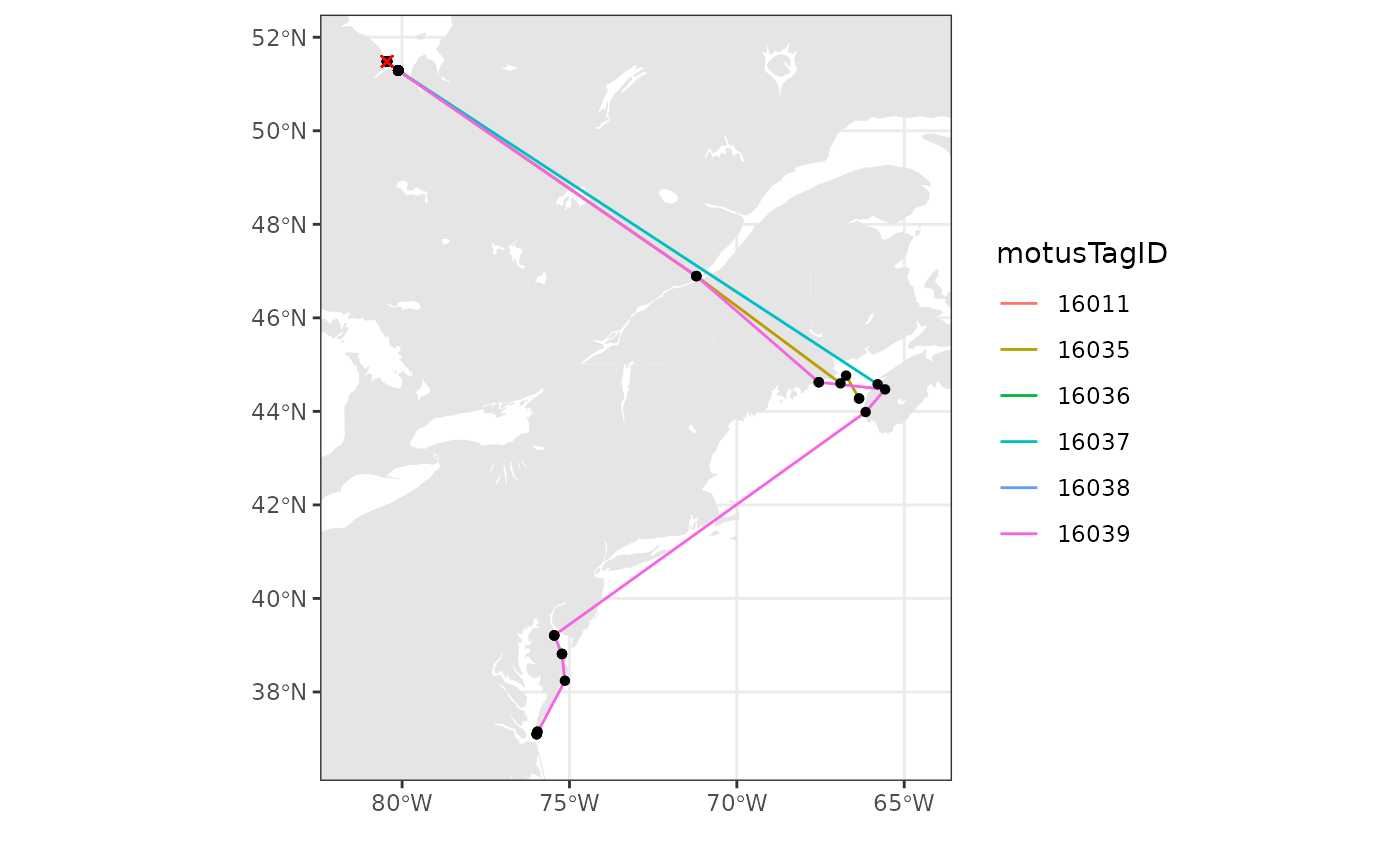 We can also add points for all receivers that were active, but did not
detect these birds during a certain time period if we have already
downloaded all metadata.
We can also add points for all receivers that were active, but did not
detect these birds during a certain time period if we have already
downloaded all metadata.
# get receiver metadata
tbl_recvDeps <- tbl(sql_motus, "recvDeps")
df_recvDeps <- tbl_recvDeps %>%
  collect() %>%
  mutate(timeStart = as_datetime(tsStart),
         timeEnd = as_datetime(tsEnd),
         # for deployments with no end dates, make an end date a year from now
         timeEnd = if_else(is.na(timeEnd), Sys.time() + years(1), timeEnd))

# get running intervals for all receiver deployments
siteOp <- with(df_recvDeps, interval(timeStart, timeEnd))

# set the date range you're interested in
dateRange <- interval(as_date("2015-08-01"), as_date("2016-01-01"))

# create new variable "active" which will be set to TRUE if the receiver was
# active at some point during your specified date range, and FALSE if not
df_recvDeps$active <- int_overlaps(siteOp, dateRange)

# create map with receivers active during specified date range as red, and
# receivers with detections as yellow
ggplot(data = world) +
  geom_sf(colour = NA) +
  geom_sf(data = lakes, colour = NA, fill = "white") +
  coord_sf(xlim = c(xmin, xmax), ylim = c(ymin, ymax), expand = FALSE) +
  theme_bw() +
  labs(x = "", y = "") +
  geom_point(data = filter(df_recvDeps, active == TRUE),
             aes(x = longitude, y = latitude),
             shape = 16, colour = "grey60") +
  geom_path(data = df_tmp,
            aes(x = recvDeployLon, y = recvDeployLat,
                group = as.factor(motusTagID), colour = as.factor(motusTagID))) +
  geom_point(data = df_tmp, aes(x = recvDeployLon, y = recvDeployLat),
             shape = 16, colour = "black") +
  geom_point(data = df_tmp,
             aes(x = tagDepLon, y = tagDepLat), colour = "red", shape = 4) +
scale_colour_discrete("motusTagID") 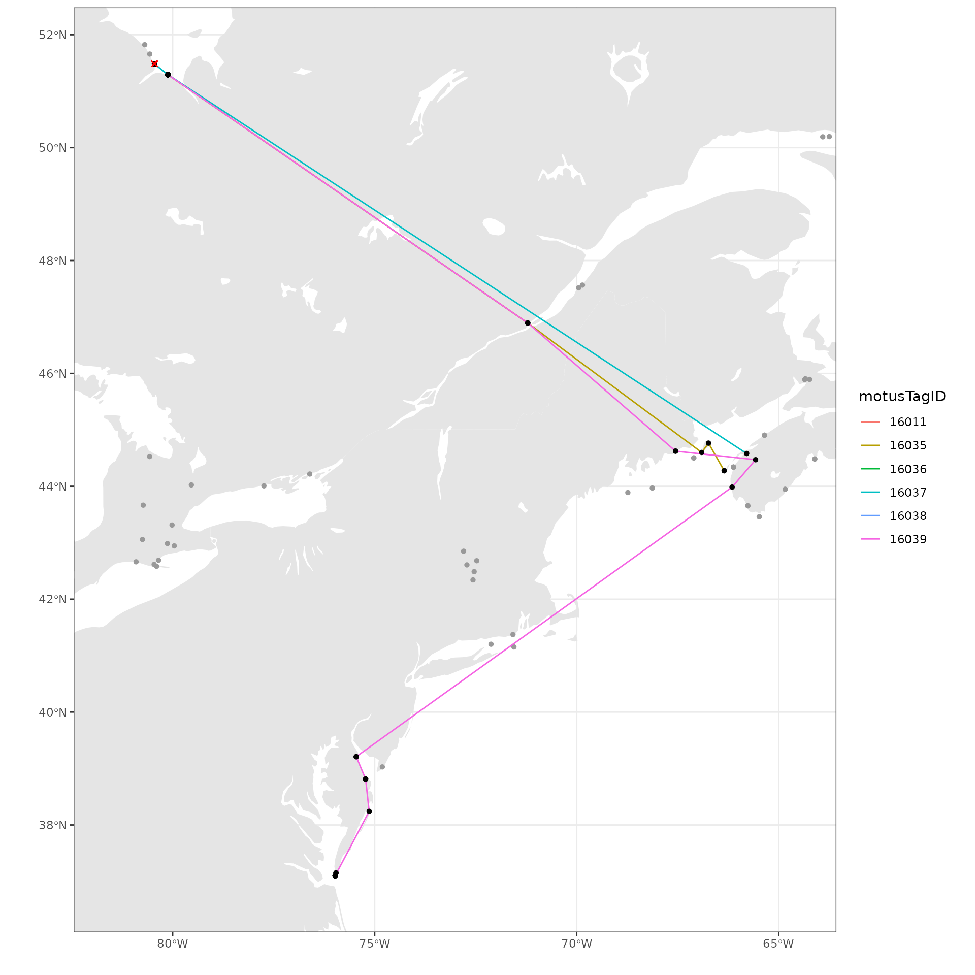
Mapping with the ggspatial package
Mapping with ggspatial allows you to select from
multiple base layers.
The first step is to convert the data to spatial data sets. Then we
can plot this data using ggplot2 and the geom_sf() function
as above. We add the base map with the ggspatial function,
annotation_map_tile(). You can change the basemap tiles by
using type = "stamenwatercolor, ( or “osm”, “stamenbw”,
among others).
We then add points for receivers and lines connecting consecutive
detections by motusTagID.
Remember that base maps generally require attribution in publications.
library(ggspatial)

# just use the tags that we have examined carefully and filtered (in the
# previous chapter)
df_tmp <- df_alltags_path %>%
  filter(motusTagID %in% c(16011, 16035, 16036, 16037, 16038, 16039)) %>%
  arrange(time)  %>% # arrange by hour
  as.data.frame()

# Convert to spatial
df_paths <- points2Path(df_tmp, by = "motusTagID")
df_points <- st_as_sf(df_tmp, coords = c("recvDeployLon", "recvDeployLat"),
                      crs = 4326)

# Plot
ggplot() +
  theme_bw() +
  annotation_map_tile() +
  geom_sf(data = df_paths, aes(colour = as.factor(motusTagID)), linewidth = 1) +
  geom_sf(data = df_points, shape = 21, colour = "black", fill = "yellow", size = 2) +
  scale_color_viridis_d(name = "MotusTagID", end = 0.8) +
  labs(caption = "Map data from OpenStreetMap")
## | | | 0% | |================== | 25% | |=================================== | 50% | |==================================================== | 75% | |======================================================================| 100%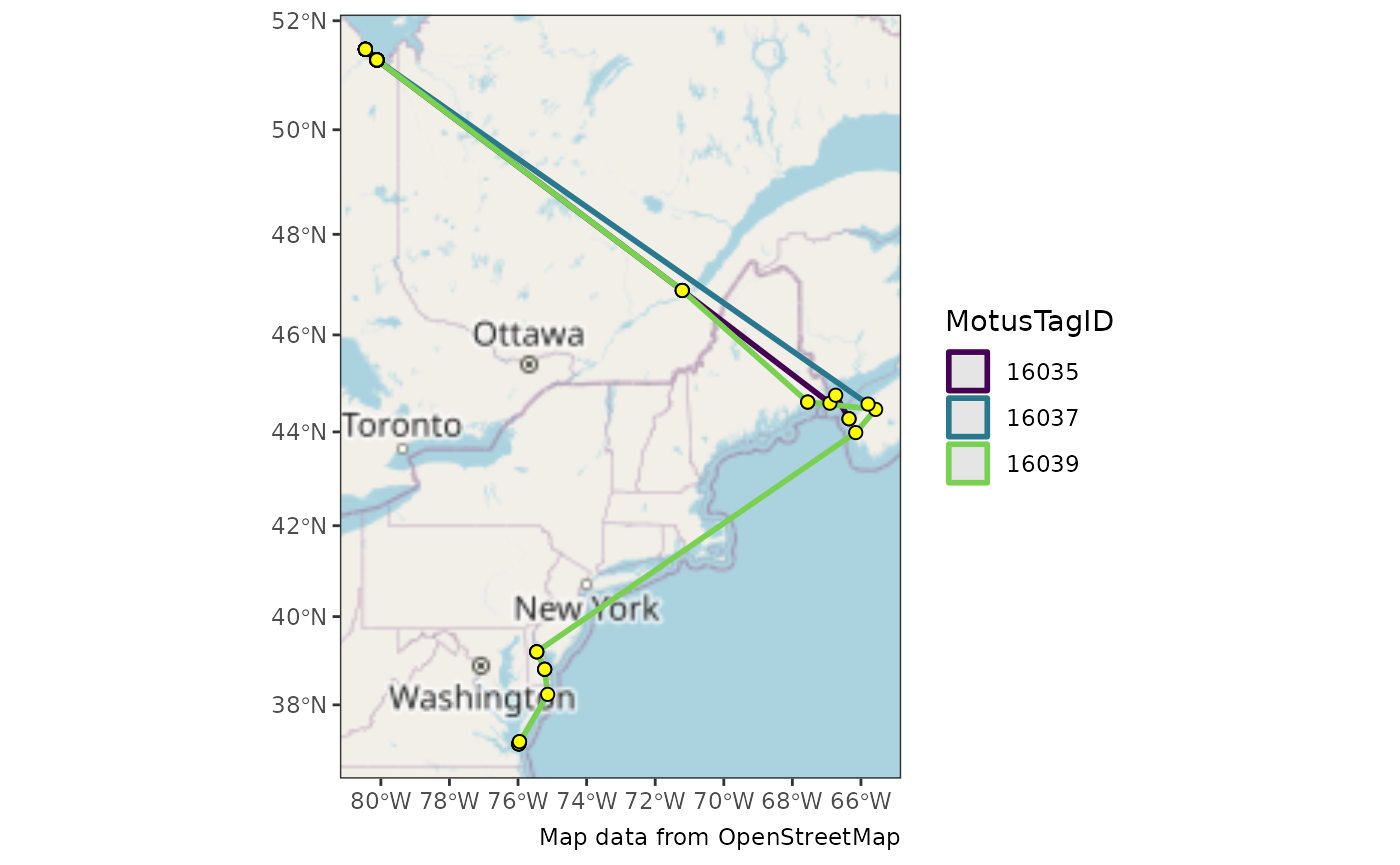
See also the plotRouteMap() for a shortcut function
which will produce a similar plot of your entire data base (optionally
limited by date).
Mapping with the ggmap package
We no longer recommend using the
ggmappackage unless you want to use Google Maps and have your own API key.
Mapping with ggmap allows you to select from multiple
base layers.
There are several ways to use the ggmap package. One is
with Google Maps, which, as of October 16, 2018, requires a Google Maps
API key (see Troubleshooting for more
details).
See the ggmap README for more
details.
The functions above provide examples of how you can begin exploring your data and are by no means exhaustive.
What Next? Explore all articles